WordPress Blogs: Endless Possibilities
With WordPress blogs, the sky is the limit when it comes to special features and functionality. However, if you don’t have an existing blog or are not familiar with the software, you may not know enough about the possibilities available to you to even know what to ask for.
Hopefully, having a list of some of the possibilities available to you might help you decide what features you’d like to incorporate on your new WordPress blog, as these are things that can greatly affect the scope and cost of the project. By providing a complete and thorough site outline up front, we’ll know exactly what you need and how much it will cost from the very beginning.
Header
The header is the first thing people will see when they come to your site; you want it to be as memorable as it is functional. The header appears on every page of your website; it’s what gives your site it’s “identity.” A header typically includes your logo/identity and main navigation elements. Other elements you may want in the header include a tagline/description, social media links, search box, or a small subscription call to action.
Logo vs. Header
We offer full logo development in addition to our blog design services; but a logo isn’t always a necessity for all blogs. Sometimes a simple typographic header can work just fine. A header gives the blog an identity without going through a full logo development process. Basically, a header is designed at the same time and as a complement to the rest of the blog design, whereas a logo is designed first and separately, then the site is designed around that.
One benefit to a full logo design is we’re often able to use branded elements (such as an icon or accent font) throughout the rest of the site design, this reinforces the brand identity and makes a site look more custom.
Menus
The navigation or menu of a blog is essentially what allows your readers to navigate from one section of the site to another. Sometimes this can be accomplished with one main menu, other times it makes sense to split it up into two menus, with the major blog sections more prominently displayed, and less-important, informational links smaller and less emphasized. Menus can also support dropdown functionality, to further organize your content and allow your visitors to navigate easily without excess clicks.
When thinking about your site navigation, think like a user. What ‘sections’ of your site are available to browse? Are there sub-sections that will need a dropdown? What pages do you want to have for informational purposes, and if more than a few, maybe they work better separated out into a secondary, smaller menu. Take a look around at some of your favorite blogs and websites and see how their navigation is structured. Keep in mind that there is such thing as too many choices, so keep it simple and straightforward for maximum usability.
We usually include another menu in the site’s footer, including a repeat of the main navigational links as well as less important pages such as Privacy Policy and Terms & Conditions (which are required but not necessarily important enough to display prominently in the header).
Sidebar
The most common blog layout includes two columns, with content space on the left and a sidebar on the right. The sizes/layout of the columns are typically determined by the required ad size and desired image size, but generally sidebars are around 300-350px in width while the content space can be anywhere from 550px wide to upwards of 780px. I generally don’t recommend going any larger than that as larger images take significantly longer to load, and generally won’t be appreciated by anyone other than those with extra large desktop computers.
While it used to be that long sidebars with lots of widgets were common, nowadays shorter is better: a more compact sidebar increases ad visibility and reduces clutter. I recommend limiting your sidebar to an about/bio section, social media profile icons, a subscription call out (if it’s not included in your header/homepage), a search form, and maybe a single content block such as popular or featured posts if you want it. On mobile, the sidebar will shift down below the content where very few people will see it (another reason to keep it short).
One increasingly common option is to go without a sidebar entirely on your homepage (example: Fifteen Spatulas, Baker Bettie, Downshiftology) or an abbreviated/split sidebar (example: Primavera Kitchen, TidyMom) to create an eye-catching homepage and draw more attention to the site content. This allows us to create an extremely unique and eye-catching homepage, what we call a magazine-style homepage. The interior/post pages will have a more typical layout with content on the left and a sidebar on the right.
Sidebars are set up utilizing widget areas, which makes your sidebar extremely flexible. You’ll be able drag and drop, edit, add, and remove widgets as needed, so you can always update this area as need be.
Homepage
The first thing your readers will see when they come to your site is your homepage. A good homepage welcomes new visitors to the site and encourages them to click around. It can focus mainly on recent content and appear more blog-like, or it can look less like a blog and more like a magazine, directing visitors to seasonal or highlighted content in various ways. Generally, this page will have fewer ads than inner post pages (as that is where the majority of your traffic will end up; the main purpose of a homepage is to give your visitors a good first impression, and fewer ads helps with that).
Deciding what exactly you want on your homepage is a big part of your overall design, both in terms of aesthetics as well as scope and price. First, ask yourself: what do you want to be the focus of your homepage? Is it recent content? Seasonal content? Maybe you want your site to be personality or service focused, in which case the homepage would be more about you and what you offer than blog content.
A homepage is made up of a combination of different types of content, what we’ll call content blocks. In the simplest form, it’s just your most recent posts. On the other end of the spectrum, in what we call magazine style, there are numerous blocks of non-chronological content, space for featured posts, maybe a video, subscription forms, and more. A magazine-style homepage often differs from the interior/post pages of a site in that it has full width content and no sidebar, or partially full width content and a shorter sidebar.
Recent Posts
It is always a good idea to have recent content displayed somewhere on the homepage, even it is just a few thumbnails for recent posts and a link to view more posts chronologically. You are running a blog, afterall, and so there are people who still will visit your site occasionally just to see what’s new. Don’t make that hard for them.
Recent posts can be displayed in a number of ways, including full-width (shown through the ‘more’ tag inserted into the post), or as teasers, with thumbnail images and short excerpts linking to the full post. One common way to display recent content prominently is to show the most recent post full-width, and then break out into teaser posts for the subsequent recent content, with pagination for users to scroll back further in time.
Categorical Content
It’s often nice to put some focus on older content, whether it be seasonal (grilling recipes in the summer, for example) or perhaps popular categories that you want to draw attention to. We can create an area where you can have a number of categorical sections, which display recent posts from a selected category of your choosing. These categories are easily managed and updated via WordPress widgets.
Featured Content
Sometimes the best way to feature multiple posts in a compact space is with a featured area at the top of the homepage, useful for displaying seasonal posts, popular posts, or other manually selected content. A featured area can be either static (not-moving) or dynamic (interactive or animated in some way, either as tabs, a carousel, or a slideshow).
A static featured area would highlight one or more posts of your choosing, but wouldn’t slide, move, or animate in any way other than maybe a random load, so every time the page changed the posts would be different. (Examples: Bakerella, The Bearfoot Baker, Bake or Break.)
The other option would be a dynamic featured area in the form of a slideshow, carousel or tabbed area. This would allow you to select a handful of posts that would rotate or slide or move in some way. These dynamic featured areas allow you to feature more content in the same space, however they are more complex and costly to implement, and not quite as efficient in terms of pagespeed (since they require scripts, albeit small ones, to function).
Other Content
What else do you want to display on your homepage? The possibilities are really endless. We can include things like a large call-to-action to subscribe to your mailing list. Or an about block with your photo and a bit about you and what you’re all about. If you focus heavily on video, maybe a space for a highlighted video. A section with image links (rather than recent posts) to your most popular categories, or maybe to seasonal categories (say you have a lot of holiday related content, having blocks that link to each holiday archive page is a great way to highlight that).
Look around at some other sites (our portfolio is a great place to start, but don’t be limited by just what we’ve done in the past). Write up an outline or even draw up a wireframe sketch of what types of content and content blocks you want on your homepage.
Posts
The post pages are the bread and butter of your site; in addition to the homepage, they will be the pages that will be viewed the most often. If you’ve got a teaser or magazine style site, the post pages will show the posts in full whenever a ‘read more’ link is clicked.
Recipes
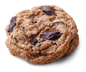
If you’ve got a food blog, you’ll want a way to display your recipes in a beautifully-formatted and google-friendly way. There are a number of great recipe plugins out there these days. Pick your favorite and we can customize it to match your new site.
Related Posts
In general, the best way to keep users clicking around your site is to include relevant related links within the content itself (this is also the most SEO-friendly way as well). However, if you want to offer up some ‘suggested’ or ‘related’ posts at the end of the post, we can set that up for you. The most efficient way is to display posts based on the categories or tags set on the current post (for example, if you’ve tagged a post ‘chocolate’, the related posts will pull other posts with the same tag). This is a very efficient setup, albeit not always the smartest and sometimes the related posts are seemingly random (the more broad your categories are, the more random these posts might seem).
For our clients who want more control over which related posts show beneath each post, we have a custom functionality we can implement that will let you hand-select related posts to display below each individual post. This may be more time consuming for you as you will have to hand select related posts for each and every post, but if you want full control, it is an option.
Call to Action
The area in between the post and the comments is often a good place for another ad space or even a repeat of your subscription form and social media profiles. This can be set up as a widget area that you can edit as needed (examples: Love & Olive Oil, A Farmgirl’s Dabbles).
Comments
Comments are built in to every wordpress blog, allowing your readers to comment and converse about each and every post. Comments are threaded, allowing you or your readers to reply to other comments easily. We can also include gravatars to visually enhance the comment display (you can get your own gravatar—or globally recognized avatar—at gravatar.com; it will show up on any site that supports them based on your personal email address). Users without a gravatar will get a default image, which we can customize to match your site.
If you have posts with a large number of comments (such as giveaways), it can often slow down the site’s loading time. Sometimes it’s best to split the comments into pages, so only, say, 50 comments display on one page.
Social Sharing
Social share buttons give your readers the option to share your posts across a variety of networks. These buttons often include a Twitter, Facebook, and Pinterest buttons; we can also display buttons to Email a Friend, Bookmark, and more, depending on exactly which services you want to utilize. Plugins/services like Po.st, Shareaholic, AddThis.com and others will also allow you to display share counts as well as log in and view sharing statistics (how many people tweeted about a particular post, for example). Decide which services you want to utilize, and check out the different options to see which one you like best in terms of appearance/functionality
Author Info
If your blog has multiple authors or regular contributors, you might want to feature them with more than just their name. It is possible to add a ‘bio box’ to the end of each post, with the author’s image and bio, plus a link to view all posts by that author (example: the Cookful, Simone’s Kitchen).
Disclosure
If there is a disclosure or other legal text you need to include on all posts, we can incorporate this text into the template itself. That way you won’t have to add it manually to the post content, it’ll appear automatically either before or after the post content (it will not, however, appear in the RSS feed).
Pages
Most blogs have a few static or informational pages, meaning the content on those pages doesn’t change like the blog pages do. An example of an informational page would be the About page or Contact page.
Contact Page
You want your readers to be able to easily get in touch with you, which is why a contact page is pretty much a given on every website. You can choose to simply list your contact information, or you may decide you want a basic email form to allow your readers to easily send you a message. Or, even better, include both. That way your readers have a choice in how they’d like to contact you.
Recipe Index
One of the most important features of a food blog is a recipe index, allowing your readers to easily find exactly what they’re looking for. There are different ways we can organize this, but the most common is a simple list of categories and/or tags.
These pages will update automatically, so if you add a new category, it will appear in the index automatically. The individual category pages are basically a customized version of wordpress’ standard archive pages, which will display your posts visually with thumbnail images and titles. Categories can also have subcategories, giving readers the option of “refining” their search (examples: Jelly Toast, Kevin & Amanda).
Recipe indexes by category will pull in all your blog categories or just the recipe-specific ones. These can be displayed as a simple list or if you have a limited number of top-level categories a visual index might be more appealing. You may also have multiple forms of categorization(such as recipes by season, region, etc–basically a series of categories and subcategories), which we can break out into separate sections. We can also utilize wordpress’ tagging feature to create an ingredient index (examples: Love & Olive Oil, Mel’s Kitchen Cafe).
We have also implemented a few recipe indexes using the FacetWP plugin. This will allow for a more advanced drill down search of recipes with live results. See our Recipe Indexes: Examples and Best Practices for more examples.
Affiliate Shop
Affiliate marketing is a great source of potential income for bloggers, both in-post links as well as a ‘shop’ page that compiles all your favorite products in one place (for food bloggers, for example, a page with affiliate links for all your favorite kitchenware products is both useful for your readers and a great source of passive income).
We’ve got a great setup that utilizes Custom Post Types to let you add affiliate items like mini posts, with titles/descriptions, featured images, and a custom field for the external URL (which can be any URL from any affiliate network, not just Amazon). It’s also possible to link to your own products, or we can customize to embed buy buttons from services like Paypal or Gumroad.
A few examples of shop pages with slightly different structures: Making Thyme for Health, Love & Olive Oil, Two Sisters.
It is also possible to connect these items to individual posts, to create a ‘products used in this recipe’ type section (Example: Love & Olive Oil). Some recipe plugins have this type of capability built in (Create and Tasty), but this separate ‘connector’ feature is always an option as well if you regularly reuse the same products and don’t want to have to add them individually each time.
PLEASE NOTE: our setup involves uploading featured images for each item. It is technically against Amazon’s Affiliate TOS to grab images from their site, modify the aspect ratios and upload them to your server (although their TOS is not entirely clear about this, but we’d rather err on the side of caution). Check the TOS for other networks to see if they allow this. Just keep this in mind as it’s ultimately your responsibility to ensure compliance with Amazon’s terms.
Footer
Your site’s footer can range from extremely simple to much more complex. At the very least, a footer should contain a secondary navigation (either repeating the main navigation or an alternate navigation), as well as a copyright notice. If you want an extended sidebar, we can add additional widget areas into the space, allowing you to add additional content that may not have fit in the site’s sidebar. Things like featured/popular posts, an Instagram feed widget, an additional subscription form are all options here.
Like the header, the footer will be the same on all pages of your site.
Other Considerations
Ads
It’s very likely you’ll need to incorporate space for ads into your new design, which often defines the overall structure of the sidebar and other spaces. There are a number of blogger ad networks out there (including Mediavine and Raptive) that make managing your ads much easier than it was in the past. The network will take care of all the placement and implementation of your ads.
That said, you’ll want to have a good idea of what ad spaces you are wanting to utilize on your website. The sidebar is an obvious place for ads, and typically will contain two ad spaces: an above the fold ad at the top of the sidebar, and a sticky ad at the bottom that scrolls with you down the page.
Other common ads utilized by networks are in-content ads, which appear automatically throughout a post at defined spacing intervals, and adhesion ads, which stick to the bottom of the browser window as a user scrolls. Both of these types of ads will be implemented by your ad network and will not affect the design end of things. These two spaces are also the most prominent ad spaces for mobile visitors.
Header and footer leaderboard ads as well as inner-post ads (between the post area and the comments) are less common than they used to be, as these spaces tend to be less visible, meaning users won’t get to them or will quickly scroll by them. For this reason we generally recommend against them, but your ad network can advise you specifically.
If you don’t have an ad network and are managing your ads yourself, you can easily insert ads into widget areas where you want them to appear on the site. Just let us know ahead of time if you require any ads outside of the sidebar (header, footer, etc) so we can be sure there are widget areas in those spaces.
SEO
SEO is not a specific service we offer. You can pay tens of thousands of dollars for SEO “optimization” with no guarantee of results, and we’re not ones to cash in on such shenanegans. However, do know that your new site will be built to current web standards and with SEO in mind; no part of the design will impede your SEO potential.
WordPress on it’s own is a very SEO-friendly platform. By simply producing quality content, establishing external links and credibility, with some time and patience you will get indexed. But if you want additional SEO considerations, installing a plugin such as Yoast or All in One SEO to give you additional meta fields (keywords, description, etc) and SEO tools to help you maximize the potential of your content.
Subscriptions/Newsletter
You’ll likely want to give readers the option to subscribe to a newsletter or to subscribe to receive feed updates via email (as opposed to in an RSS reader like Feedly). Keep in mind these are two different things: a newsletter allows you to send messages directly to your subscribers; what you include in those messages is completely up to you. An RSS email subscription will simply email the subscribers whenever a new post has been added.
There are a number of email services out there. Kit is our favorite, but others like Mailchimp, Mailerlite, and Flodesk are great choices as well. All of these services will provide you with an embedded form code, which we can customize to match your new site (some services are easier to customize than others).
Mobile
With the growing prevalence of web-ready mobile devices, you want to be sure your site can be accessed and is functional on these devices. We build all our sites to be fully responsive, the content changing/resizing/rearranging depending on the device and the size of the screen on which it is viewed. For example, the sidebar will move down below the content and the posts will fill the width of the screen, to reduce the need for a manual zoom. We do not advocate creating a separate mobile site, rather, the site is set up to shift and change depending on the size of the device on which it is viewed. No content (including ads) is ever hidden or inaccessible, just optimized, creating an ideal browsing experience.
Mobile navigation will be different from the desktop as well, generally a solid bar that sticks to the top of the screen view that will expand the menu options when clicked.
Existing Content/Import
If you’ve already got a website you’ll want to include your content in the new site, right? Of course! If you’re already running wordpress this is easy (obviously). But if you’re running Blogger or another blogging platform, importing existing content can be more tricky.
We have a system in place that works well 98% of the time, and will transfer all your content from Blogger as well as forward your old links to the corresponding page on the new site. However, due to some software quirks that are out of our control, sometimes there are issues with this process. The issues tend to be magnified on larger sites. We promise that we will do our darnedest to get all your content moved in once piece; but we cannot guarantee that every single one of your posts or (more likely) all of your comments will survive the move.
What if you happen to have another software system in place, other than wordpress.com or Blogger? Once again, we’ll do our best. There are many resources out there for transferring content from other platforms like Drupal, Typepad, Moveable Type, etc. Even if we’ve never worked with it before, we are happy to look into it further.
Whether you are on WordPress or another platform, and especially if you have a food blog, you should expect to spend some time reformatting your existing posts within the new design. You’ll want to be sure you have featured images set for each post (featured images show up in the archives, search results, and related posts areas, for example), as well as moving your recipe information into the appropriate fields. For clients moving from Blogger, we also recommend cleaning up the cruft code that Blogger leaves behind. This can be time consuming, so prepare yourself; but you don’t necessarily have to redo all your posts before the site can be launched. Any older/unformatted posts will still be readable and accessible; they just won’t have the fancy features and bells and whistles that newer posts have.
Anything Else?
The purpose of this (lengthy) article was to expand on and list out some of the many possibilities available to you. Use it as a menu of sorts; choosing which features you may want to incorporate into your own site. Not everything listed here is necessarily an “add-on” or extra cost. Some are basic, fundamental features we include in all our sites, whether you ask for them or not. It’s important for you to make a list of the features you absolutely have to have, and also the features you might want to have. We’ll take the entire scope of your project into consideration and determine the final cost based on the project as a whole.
Also, just because something isn’t listed here doesn’t mean it isn’t doable; with WordPress, chances are that if you can think of it, we can make it happen. Just ask!