Mobile Responsive Design: Demystified
As of 2014, mobile users account for over 50% of all traffic on the web. That means it’s not something you can continue to ignore.
Mobile design has been on the minds of bloggers of late, even more so within the last 12 months when mobile traffic finally surpassed desktop traffic, and that percentage will only keep growing. This change in how people consume information on the web means that we have to rethink how we present that information. A website that accounts of users accessing your site on myriad different screen sizes will ensure that they all have the best experience possible.
What is Responsive Design?
Responsive design is just that: it is design that responds to your user. In this case it refers to the size of the screen on which the website is being viewed, responsive design will adapt itself to whatever that size may be.
From Wikipedia: Responsive web design (RWD) is an approach to web design aimed at crafting sites to provide an optimal viewing and interaction experience—easy reading and navigation with a minimum of resizing, panning, and scrolling—across a wide range of devices (from desktop computer monitors to mobile phones).
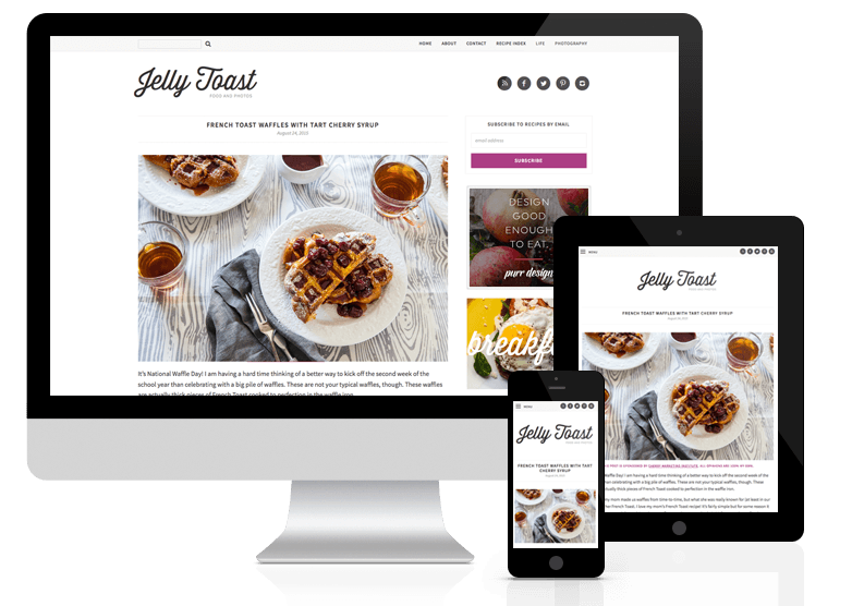
Basically, responsive websites will resize, shrink, stretch, and rearrange itself to perfectly fit the screen on which it is being viewed, from a giant desktop monitor to the smallest mobile phone. Your users will be able to read and navigate your website without any pinching, zooming, or panning. Text will be readable and images big and beautiful and navigational menus easily accessible on mobile devices.
Some mobile/responsive themes have a few set breakpoints that alter the layout (at the main sizes for iPad/iPhone screens, for example). The problem with this technique is that as new devices continue to be released and updated, those specific resolutions are always changing. What was a practical breakpoint two years ago is irrelevant now that there are iPhone 6 and iPhone 6+’s out there viewing your website.

Instead, we take a fluid approach as you can see in the example above, making your website shift and shrink and flow to fit the screen on which it is being viewed, no matter how big or how small that may be.
Responsive Design vs a Separate Mobile Site/Theme
Way back in 2010, the way most sites handled this new surge of mobile traffic was to create an entire mobile site. Browser detection would determine whether you saw the main desktop version of the site or the more limited mobile version. If you’ve ever seen a http://m.whateversite.com in your browser, that’s what you’re seeing: a completely separate version of a website designed just for mobile users. These mobile sites made decisions for users as far as what content they may want to see, and hid the rest that was deemed unnecessary. For obvious reasons this way of handling mobile users is no longer standard practice.
There are a number of mobile plugins or mobile themes available today you may have heard of (examples include WPTouch as well as the mobile ad themes from PadSquad, AdThrive, etc.) These are separate themes entirely: triggered when your site is accessed on a mobile device, they overwrite whatever custom theme you have in place. So while it is not a completely separate mobile site, it is essentially an entirely different theme that is loaded for mobile users. As a result you will lose much of the color/personality/special features that you have in place with your custom design.
Additionally mobile-only sites/themes will likely change the content that is displayed. Maybe they’ll only show your recent posts on your homepage, and not the custom categorical sections or featured post area that you have on your desktop site. Most likely they’ll hide your sidebar entirely, which means that information (such as your personal bio or archive links) will no longer be accessible on a mobile device. This is one area where mobile responsive design is far superior: it never hides any content (unless you want to, of course), instead, it simply rearranges it so that your main content is front and center within the limited real estate of the mobile device, but the rest of the content is still accessible should your reader want to access it. Mobile users want to see the same content as desktop users, and there’s no reason not to show it to them.
Usability & SEO Benefits
The benefits to a good responsive design are numerous, but mainly it’s about improving user experience for your readers on mobile devices. They no longer have to pinch and zoom to read your content, or pan around and try repeatedly to click on a tiny navigation link to find what they are looking for. A mobile friendly site will resolve all these issues, making your website easier to use and navigate on small screens. Your readers will thank you.
In addition to the user-based reasons to make your site mobile friendly, in April of 2015, Google announced it will begin using mobile-friendliness as a ranking factor. While it may be a small consideration in your overall search ranking, it’s still an important one. You can test to see if your site is mobile friendly using Google’s mobile testing tool. Sites deemed mobile-friendly will display a subtle “mobile-friendly” tag on search queries performed on a mobile device (desktop search will remain unchanged).

With Regards to Ads/Ad Revenue
Years ago, bloggers worried about lost ad revenue when switching to a mobile responsive design. And back then, advertisers still hadn’t quite gotten their footing when it came to mobile-optimized advertising.
Nowadays however, this is no longer a concern. Most ad networks such as Mediavine support mobile advertising within a custom responsive design. In fact, you’ll likely see a majority of your ad revenue coming from these ad spots vs the traditional desktop sidebar ads.
Considerations
In today’s internet landscape, mobile design is no longer optional. For this reason we build the cost of responsive development in to every project we do. Even if you plan to use a mobile ad theme at the moment, if you ever change your mind and decide to remove it, you’ll have a perfect mobile responsive design ready and waiting underneath.